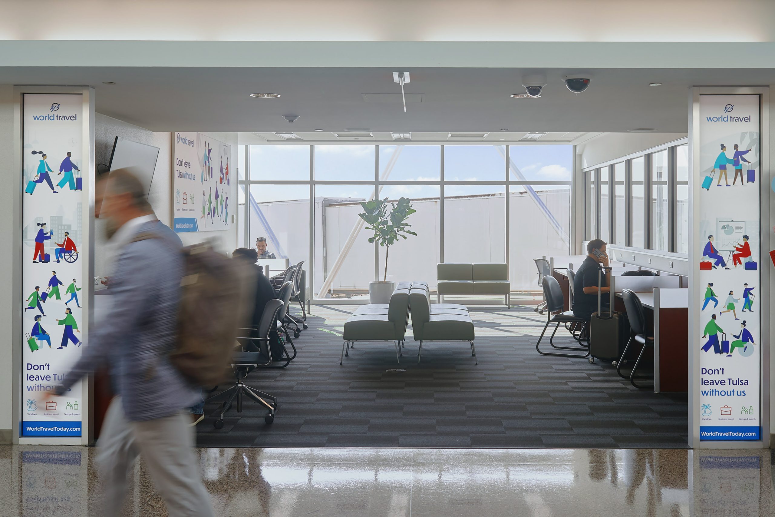
World Travel Airport Campaign
PROJECT SPECS: Brand & Creative Strategy, Advertising Design, Illustration, Content Strategy, Wall Graphics & Signage
World Travel has been moving people since 1959. For over six decades, the Tulsa-based agency has built its reputation on something increasingly rare in the travel industry: real people answering the phone, fast solutions when plans fall apart, and the kind of service that makes a stressful layover feel manageable. They don't just book trips; they take ownership of the journey.
When World Travel came to Good Creature, they had a specific ask: design their airport ads. But as we sat down with their marketing department and dug into what the ads actually needed to accomplish, a deeper creative challenge came into focus.
The Challenge: Three Service Pillars, One Ad
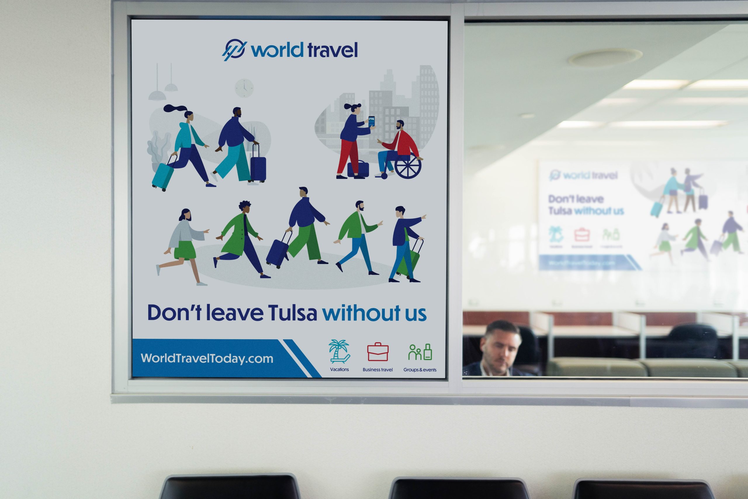
World Travel serves three distinct audiences through three distinct service lines: Vacations, Business Travel, and Groups & Events. Each pillar has its own color palette and logo lockup on their website, a system that works digitally where visitors self-select their path. But in a single airport ad, that approach breaks down. You can't run three logos at once without confusing your audiences. You can't divide a poster into thirds and expect it to catch anyone's eye.
Working alongside their marketing team, we defined the real problem. Three travelers, three promises: the family heading to Cancún, the executive catching a red-eye, the event planner coordinating 200 people. How do you reach all three in one campaign that still feels modern, human, and distinctly Tulsa?




Our Approach
We started with what World Travel already had. Their brand assets were strong with a recognizable mark and colors already assigned meaning across each pillar, but those assets weren't being deployed to their full potential in advertising. Rather than reinventing what existed, we looked for a way to activate it.
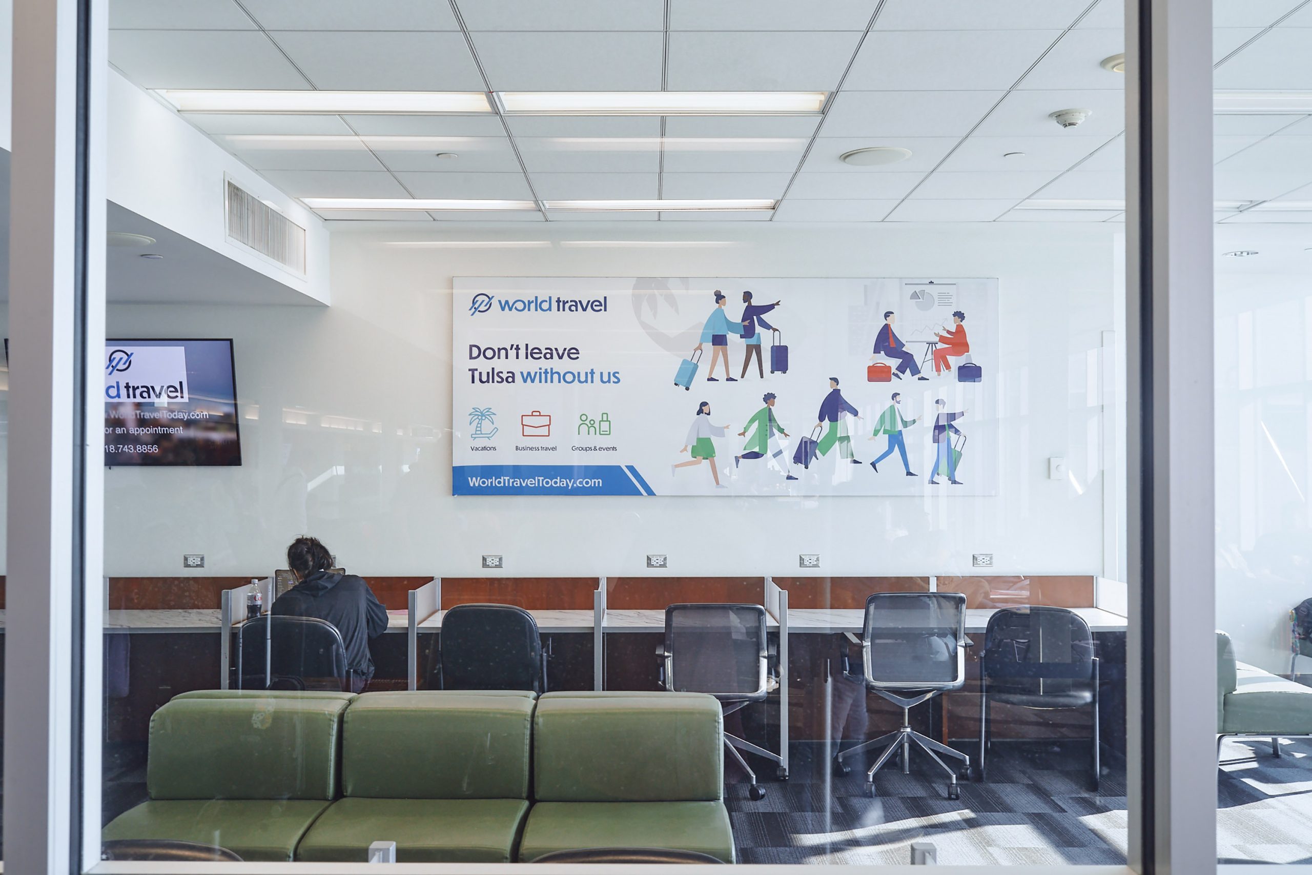
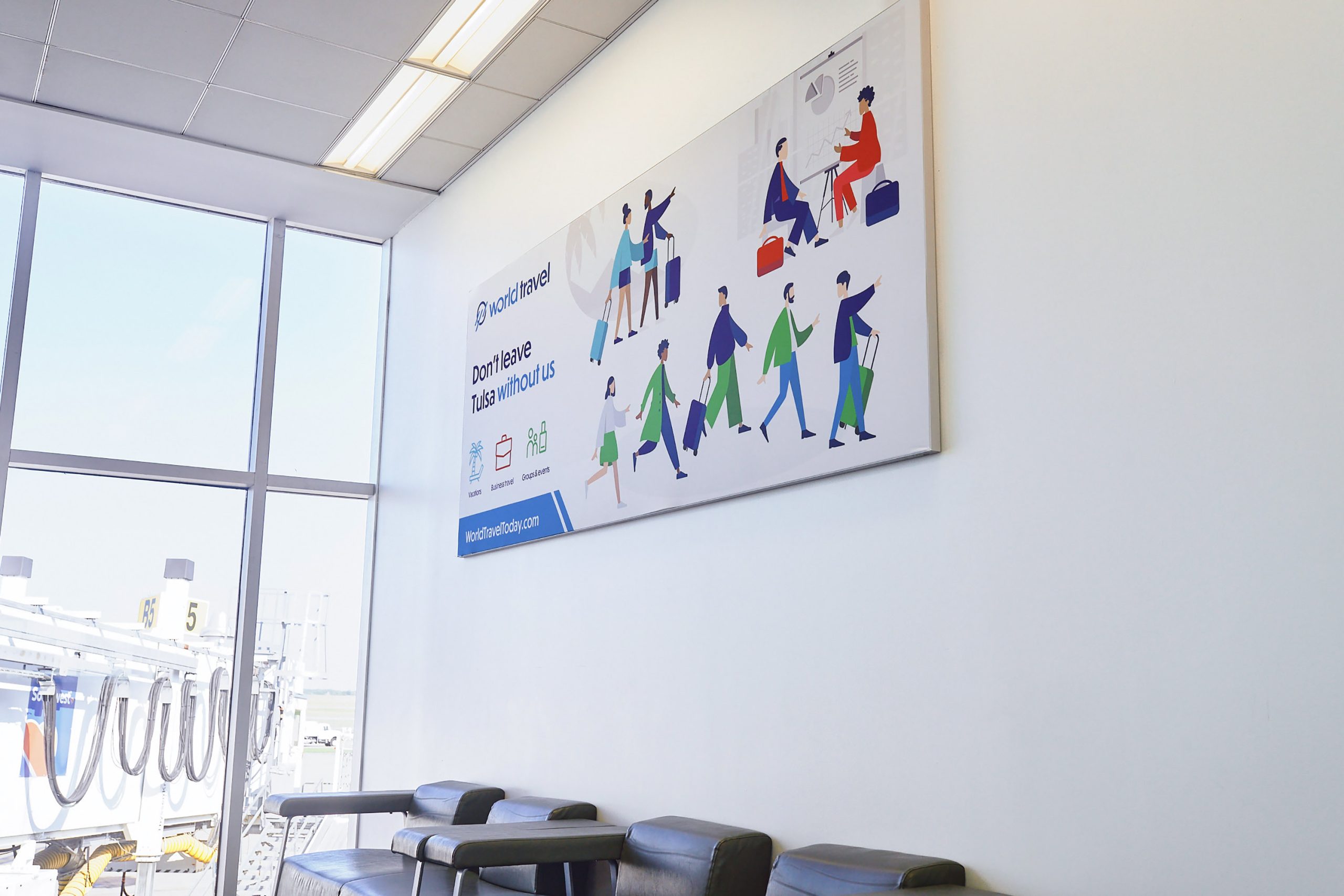
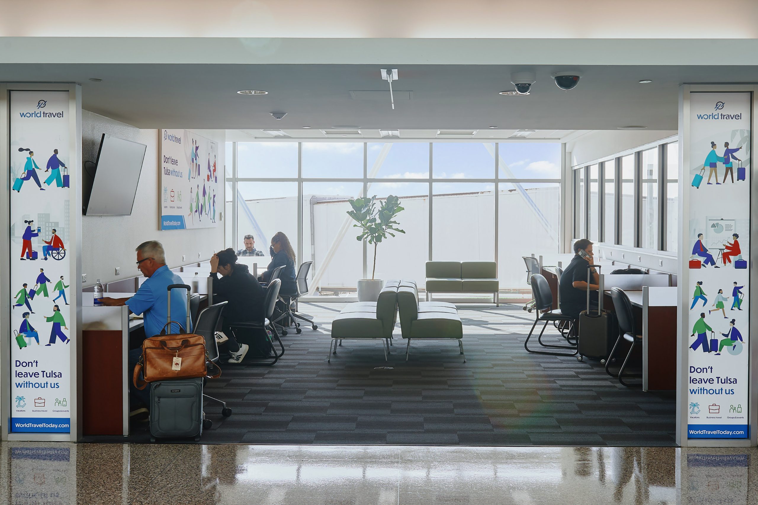
The three service pillars were each given their existing brand colors, creating clear visual differentiation across the campaign without introducing new brand elements. We then layered in World Travel's existing iconography to reinforce each pillar at a glance.
The real creative lift came in the illustration. We wanted to introduce it in a way that told the story of travel for each audience. Business travel. A family vacation. A group on the move. Each scene is distinct, but drawn from the same visual language: modern, human, and vibrant.
The Solution
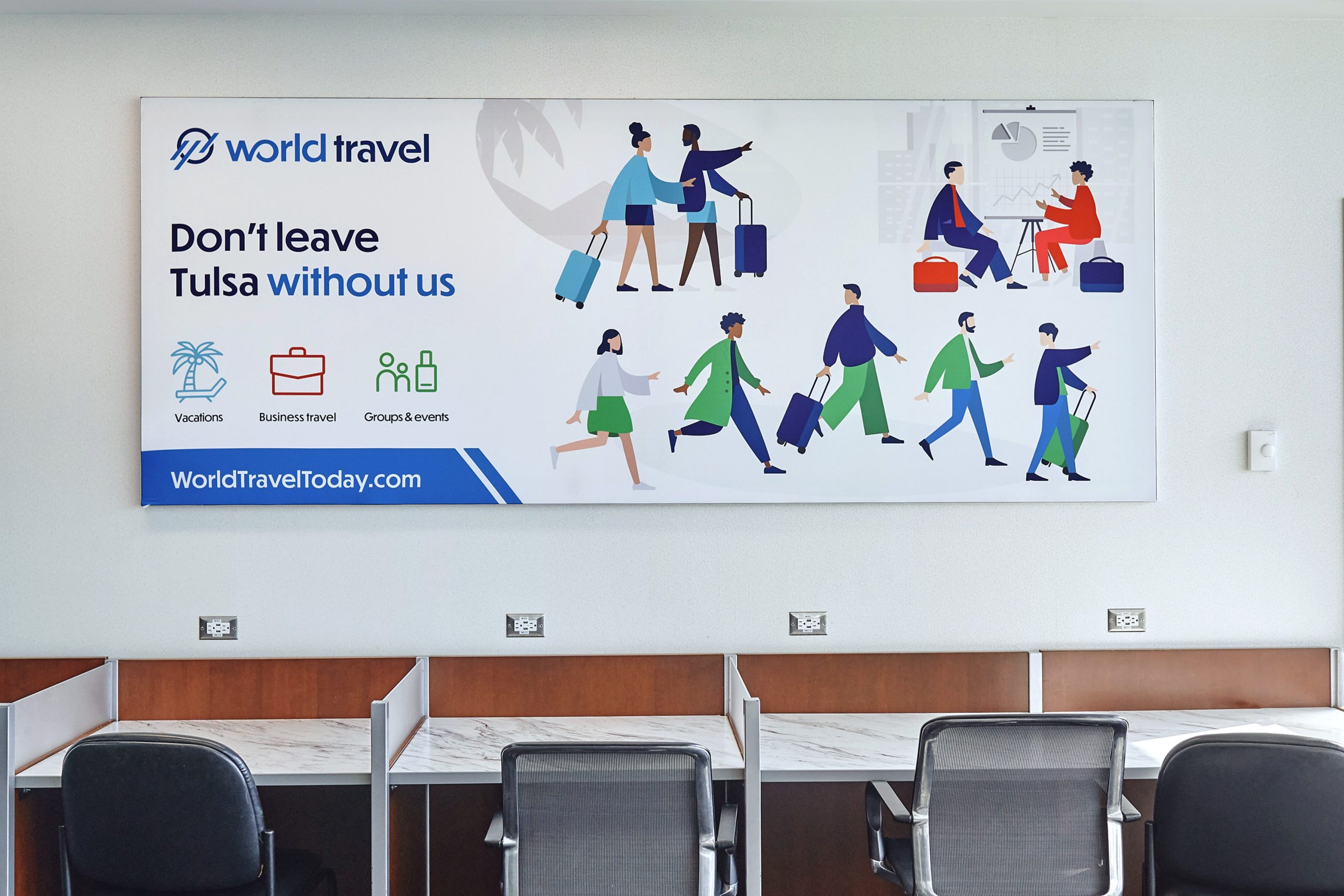
The airport ad campaign gives World Travel a visual system that works hard inside a single frame. The execution uses brand color to signal distinct pillars, custom illustration to tell the traveler’s story, and a tagline to unify the journey. The result is three distinct messages that still read as one coherent campaign and are specific enough to speak to each traveler, cohesive enough to build the World Travel name.
The approach not only satisfied the ask for new ads, but it resolved World Travel’s bigger core advertising challenge: how to represent all three service groups without cluttering a single ad with three logos or three competing visual languages. Color and illustration carry the differentiation. The wordmark holds it together.
What It Means
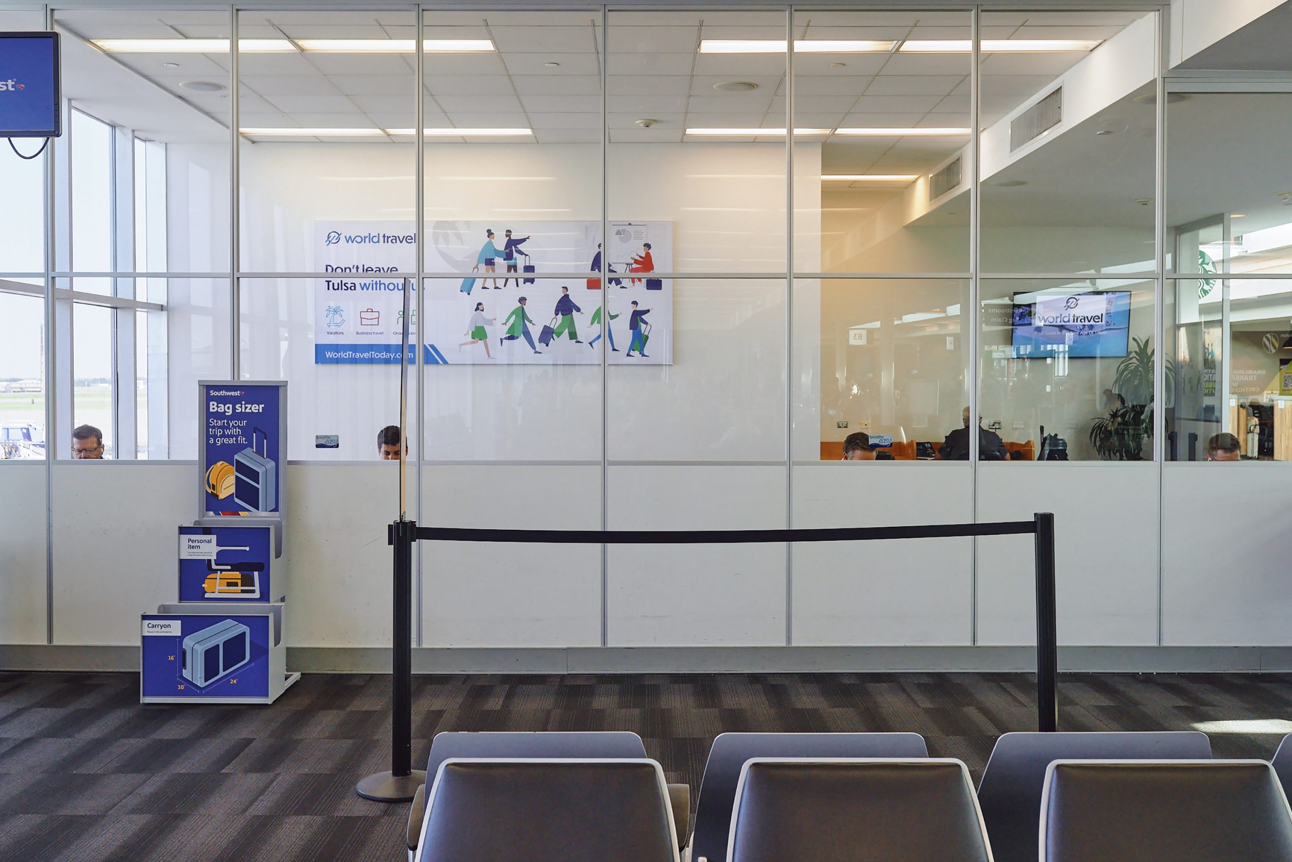
At the final site visit with World Travel and the head of the airport's art department, the response from both came back to the same thing: the color. The palettes that had been sitting underused in the brand guidelines turned out to be the campaign's most visible asset — the element that made three service lines legible as one system from across a terminal.
The best advertising solutions often come from collaboration; from sitting down with a client's marketing team and asking not just "what do you want it to look like?" but "what does it actually need to do?" For World Travel, that conversation revealed a campaign strategy that was already latent in their brand assets, waiting to be used.
More of A Good Thing



WORKING WORLDWIDE,
REMOTELY FROM TULSA, OK.
email us: hey@goodcreaturestudio.com
follow us: @goodcreaturestudio
A MISCHIEF & CO CREATIVE, LLC COMPANY
© 2026 GOOD CREATURE
Please don't steal anything,
or feed our work to AI. <3